Good Eggs
Good Eggs is a premium grocery delivery service operating in California since 2015. The brand is known for its incredible produce and has maintained some of the highest food standards in the industry.
From Studio worked with their VP of Marketing to breathe life and color back to the brand after many years without a clear vision and voice.
Services
Brand Refresh
Art Direction
Template Redesign
Credits
VP of Marketing, Good Eggs: Christine Hendrickson
Photography: Erin Scott Studio
Photo Assist: Mark Davis and Andy Omvik
Food Styling: Lillian Kang
Styling Assist: Paige Arnett and Allison Fellion
Art direction
Our approach to the art direction was centered around a few key words: warmth, approachability, and aspiration. We accomplished this with looser, more candid compositions in combination with lighting that feels more natural—evoking an environment outside the frame.


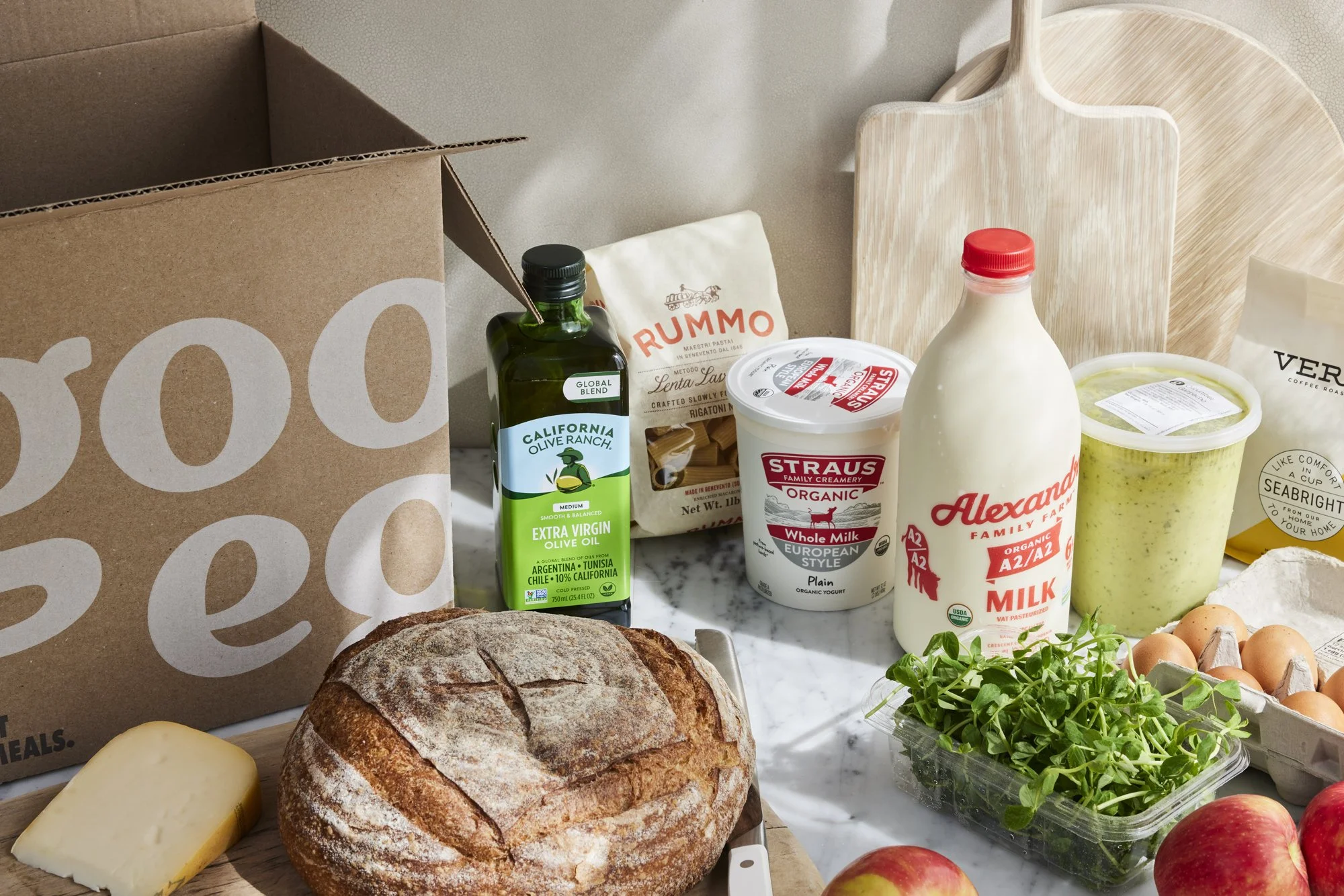
Updated evergreen hero imagery that spoke to Good Eggs’ excellent selection and incredible produce.
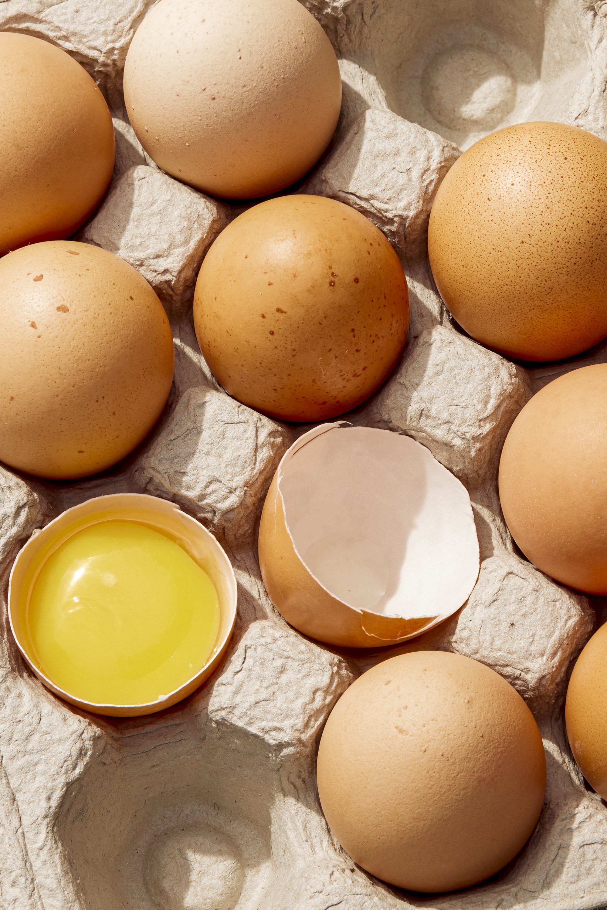
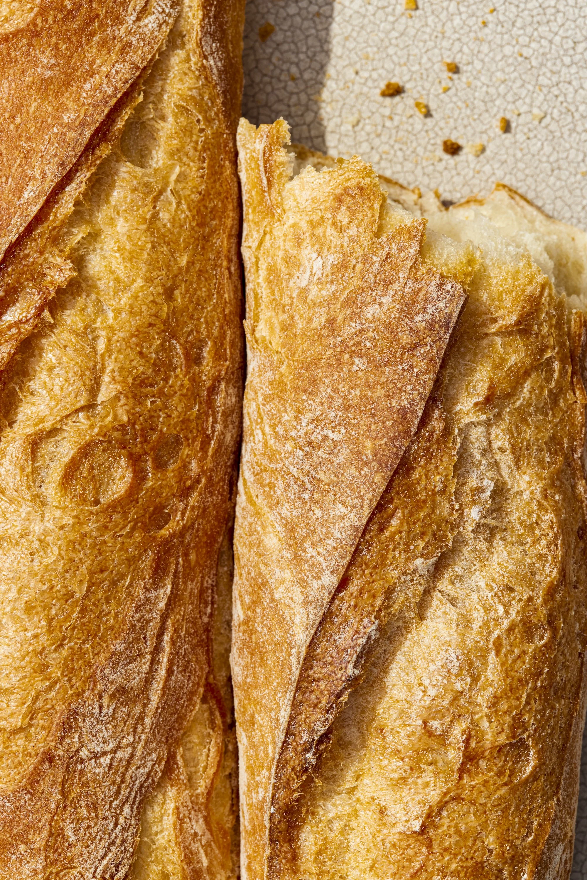
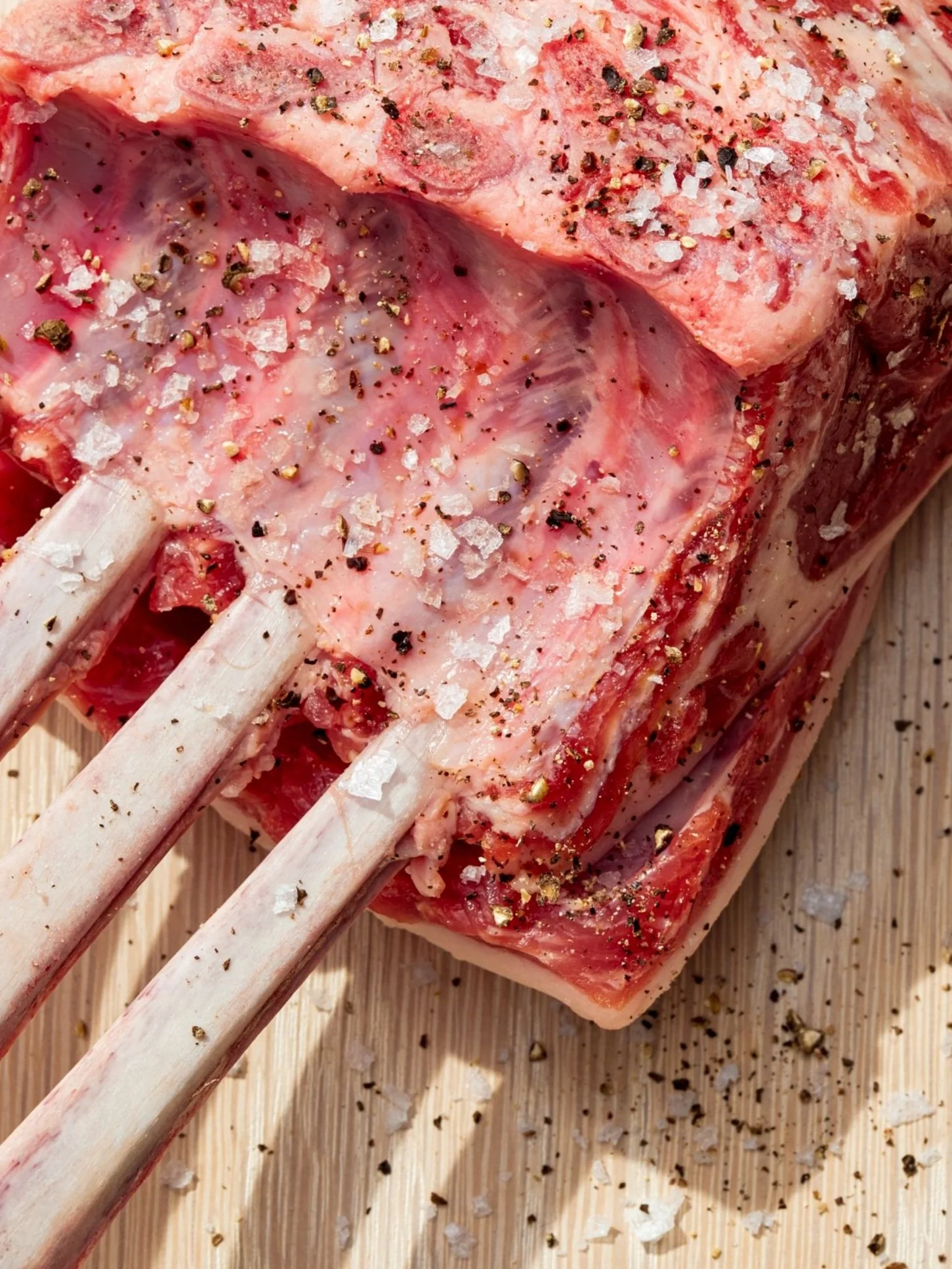
Core category imagery across dairy, bakery, produce, and meat. These iconic images were meant to be not only mouth-watering, but also have a graphic, clickable quality to them.
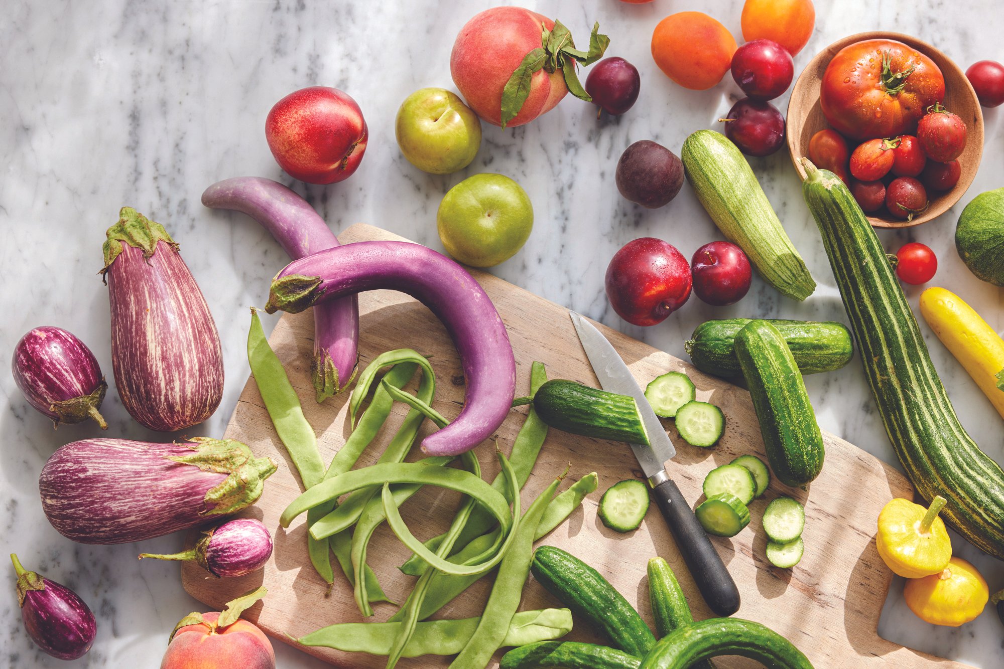


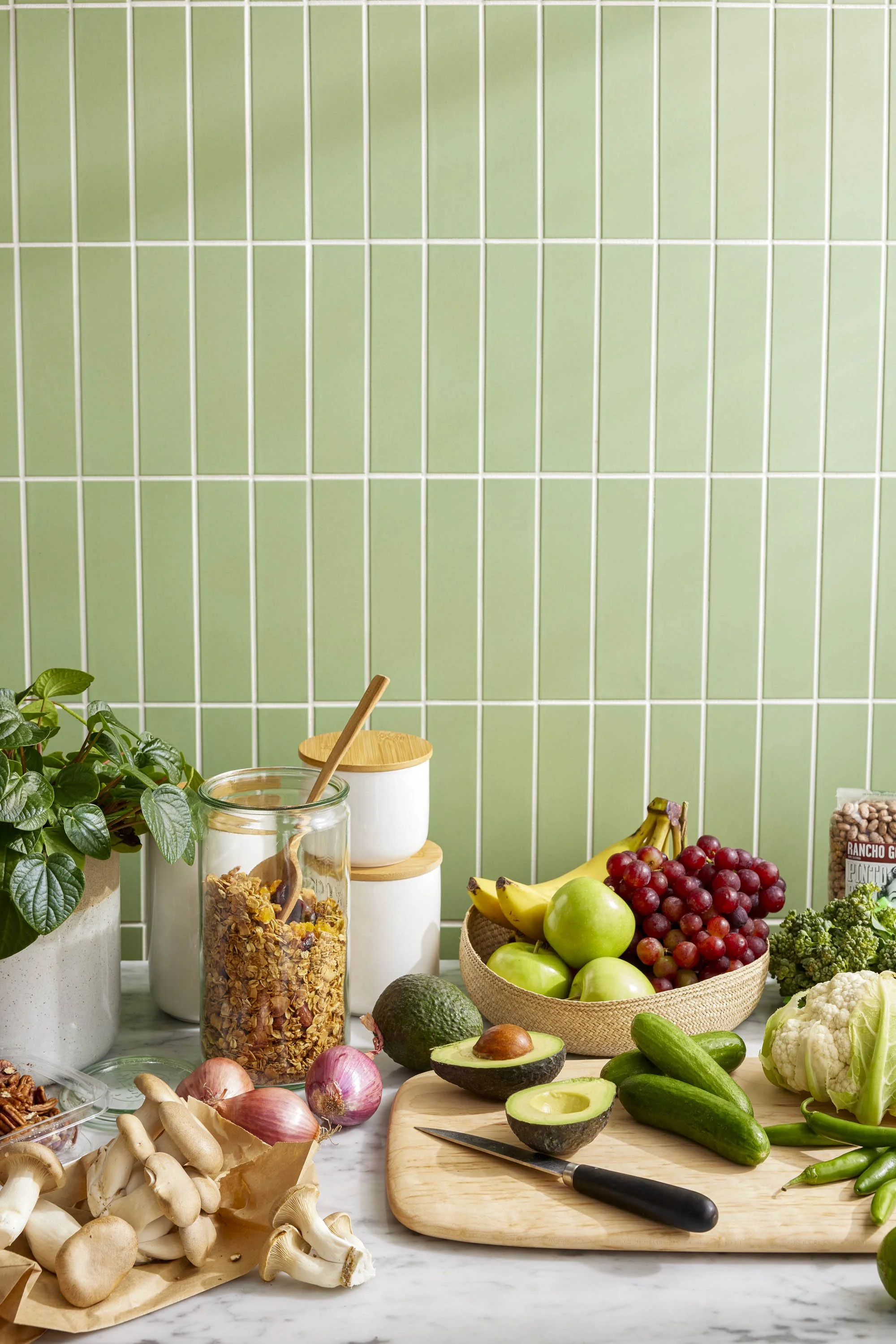
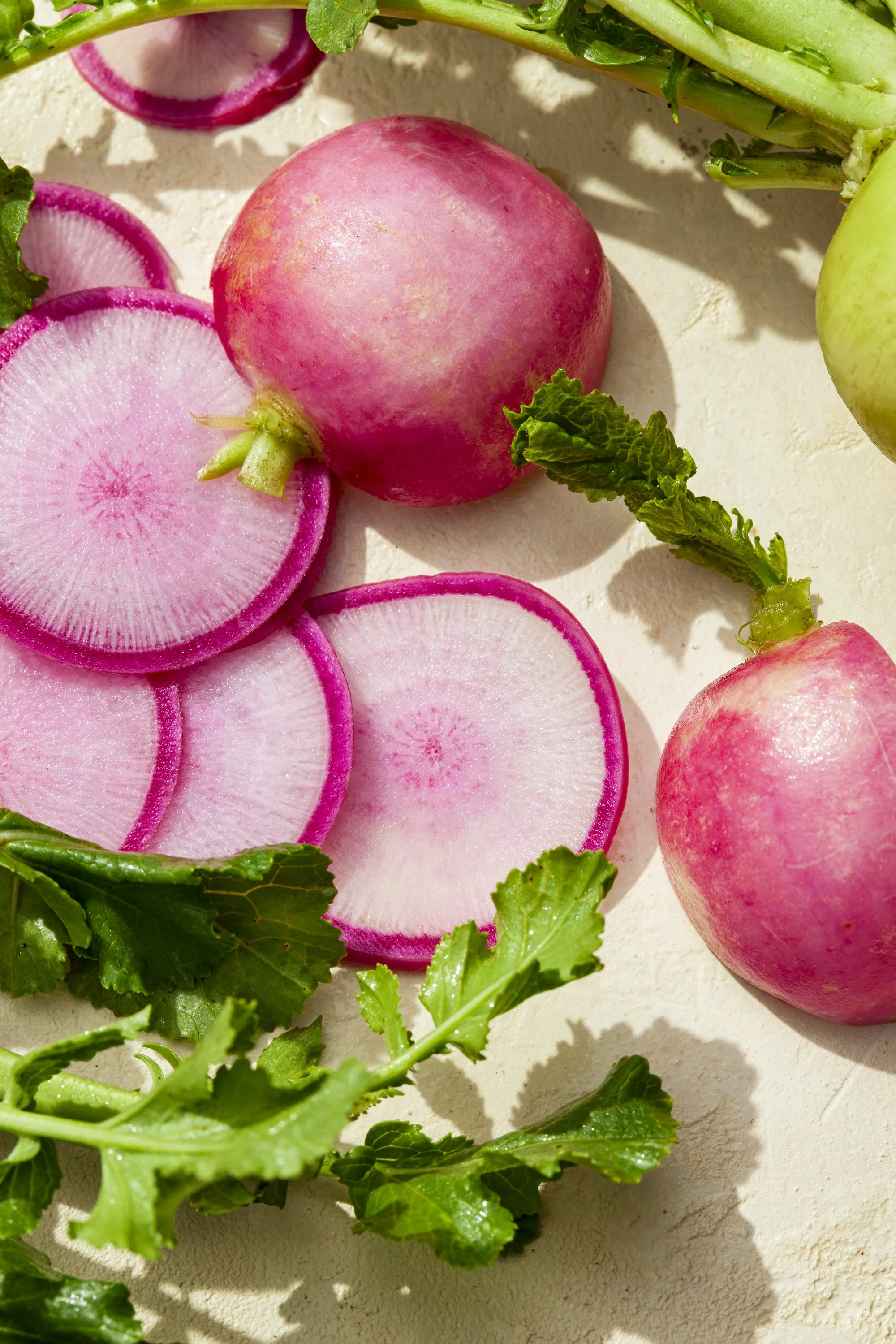
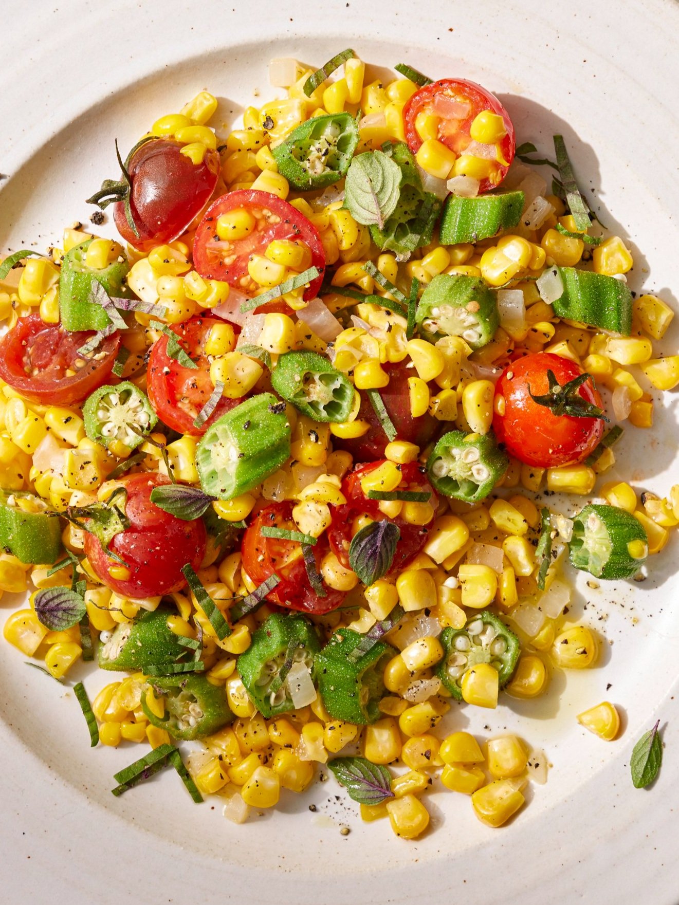
In our art direction, we prioritized capturing the breadth and depth of Good Eggs’ produce selection. These seasonal tableaus make fruits and vegetables the most mouth-watering part of the meal.
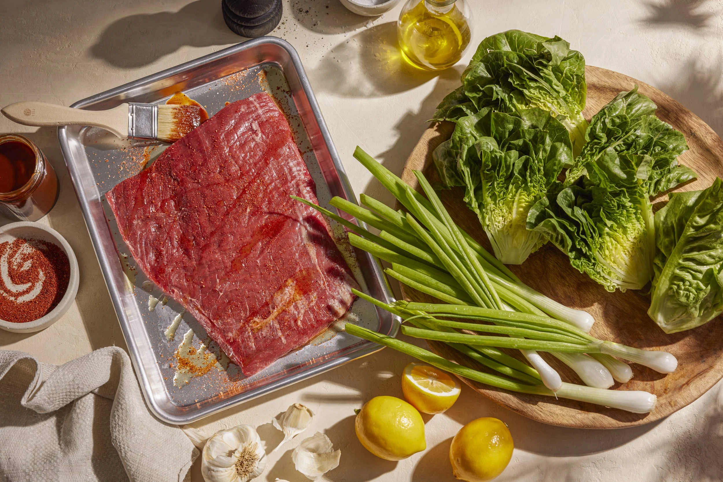

What are premium groceries without the chefs and home cooks that craft beautiful meals with them? These scenes communicate that quality and the joy of using wonderful ingredients.


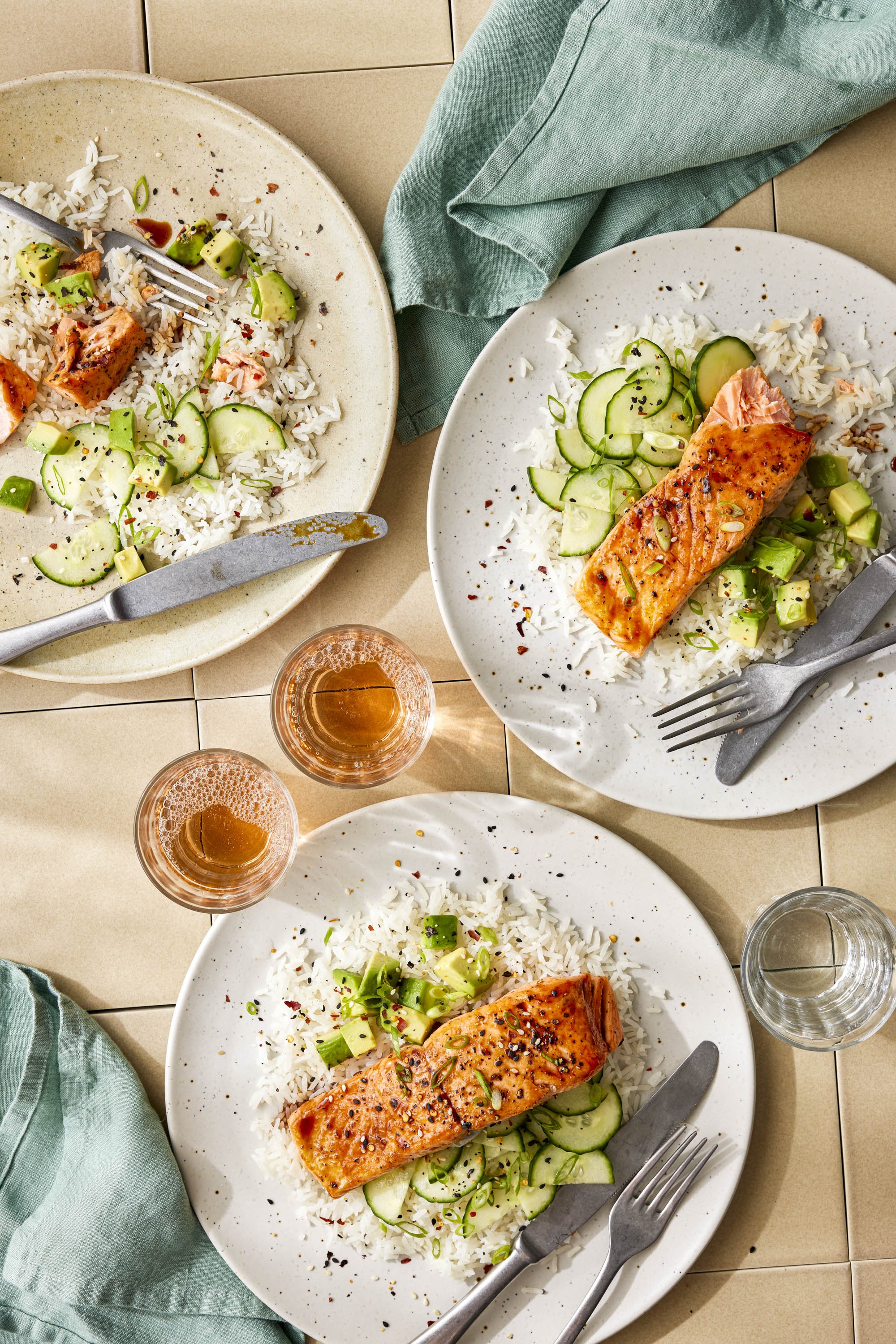

Meals for everyday, crafted with vibrant ingredients bursting with flavor.


Highlighting brands in a way that feels natural and relevant to the consumer.
Design Direction
Our brand refresh took Good Eggs from a primarily black and white world to a more colorful, lifelike one. The updated typefaces were chosen to signal sophistication, taste, and friendliness. We paired the updated typography with a set of colors rooted in nature.
Typography
Headlines: Concrette M by Displaay Type Foundry
Body and eyebrow: FK Grotesk by Florian Karsten Typefaces

Sample typography in use

Updated core color palette
Template Refresh
After aligning on the core design language updates we moved toward implementing those across various touchpoints. We focused on unifying the brand across touchpoints, building a modular system for ultimate flexibility, and creating templates geared toward in-depth storytelling.
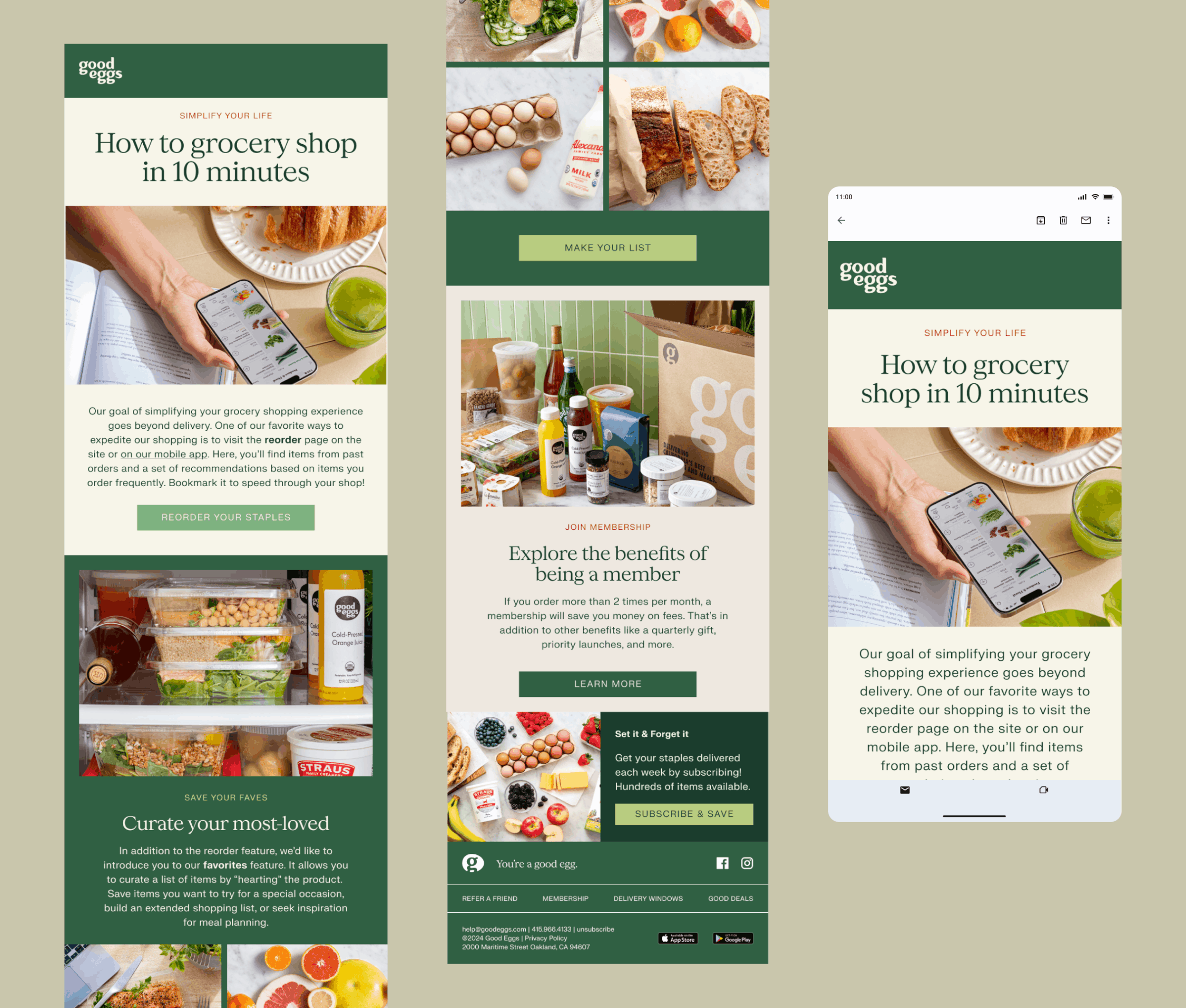
Email Template Refresh
Our redesign of Good Eggs’ email program was rooted in variety. To serve the brand’s broad range of story types, we opted to design a set of interchangeable modules. This allows the team to curate different templates depending on their marketing needs, leaving the reader with a more vibrant experience.


Direct Mail
Print mail and in-box inserts also got a facelift. In addition to refreshing these pieces with the updated brand identity, we also led a shift in the content strategy. We prioritized more graphic, image-based content, with fewer large blocks of copy, for a far more digestible experience for the reader.