Good Eggs
Rediscovering the identity of a premium grocery delivery service.
Good Eggs is a premium grocery delivery service operating in California since 2015. The brand is known for its incredible produce and has maintained some of the highest food standards in the industry.
From Studio worked with their VP of Marketing to breathe life and color back to the brand after many years without a clear vision and voice.
Services
Brand Refresh
Creative Direction
Template Design
Content Strategy
CALIFORNIAN
PREMIUM
FOOD-CENTERED
WARM
LIVED-IN
COLORFUL
CALIFORNIAN PREMIUM FOOD-CENTERED WARM LIVED-IN COLORFUL
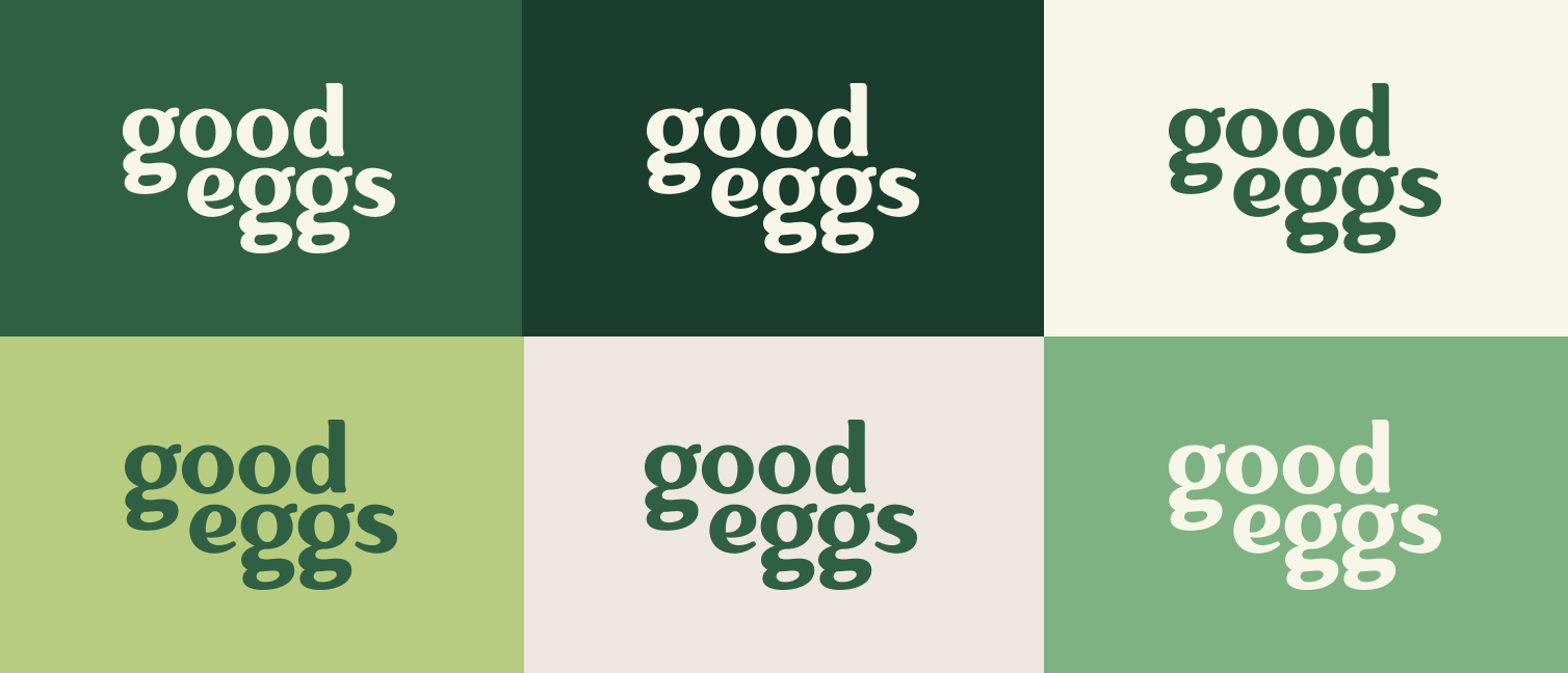
Color Palette
Green is a ubiquitous color in grocery. We decided to lean into this fact by building our brand around various shades of green. In this application, green becomes a more neutral tone with less saturated hues being accented by slightly less common shades.
Design Approach
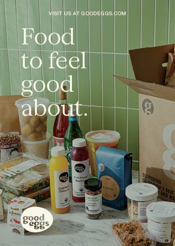
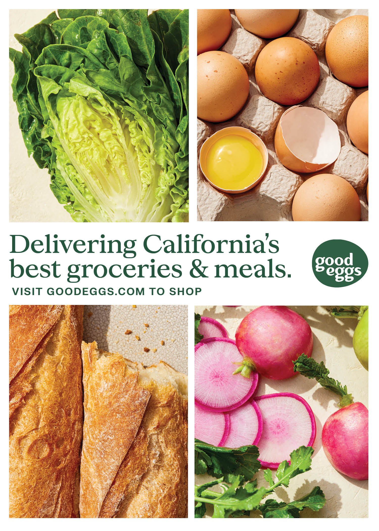
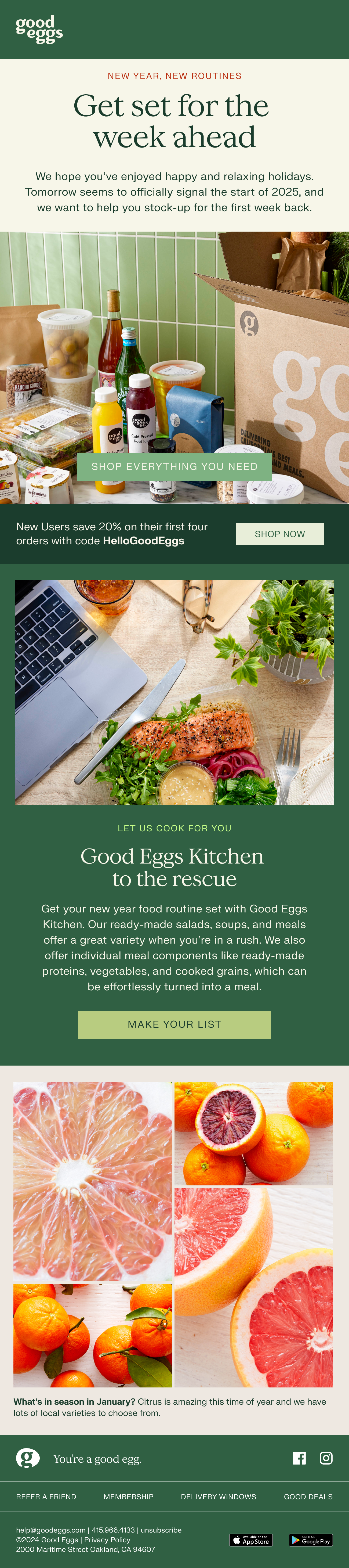
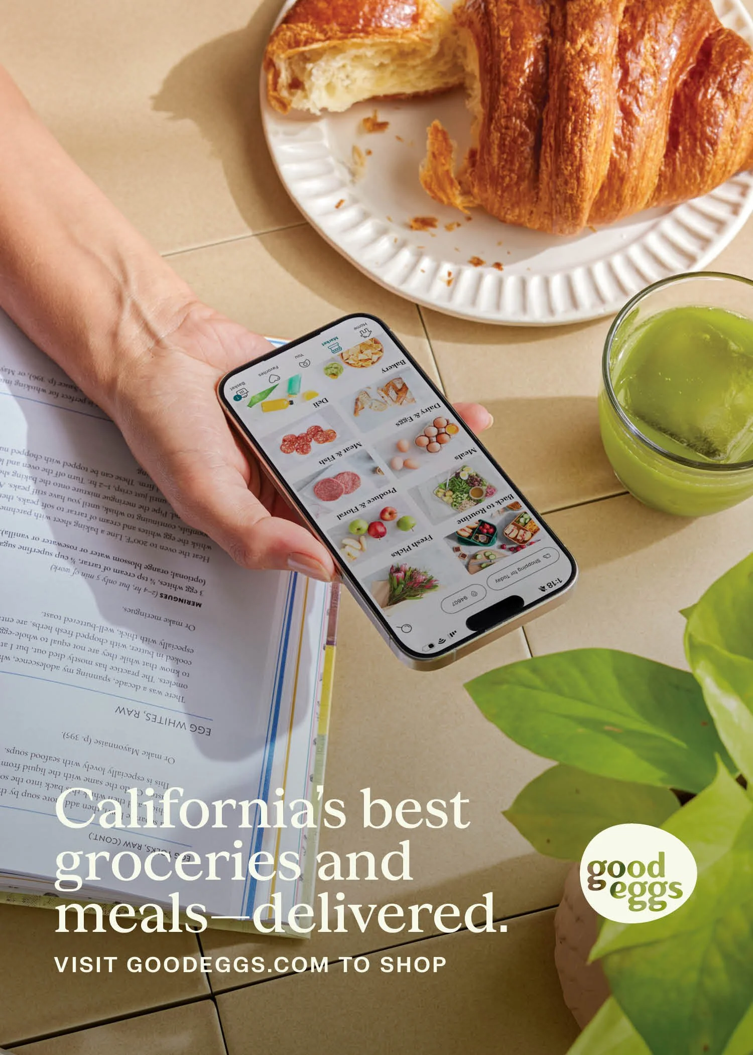
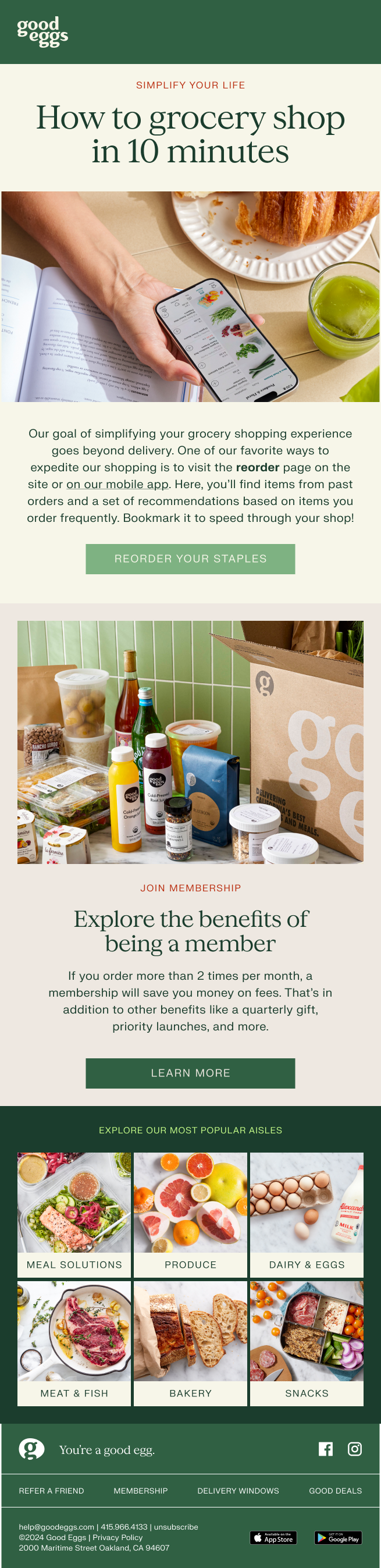
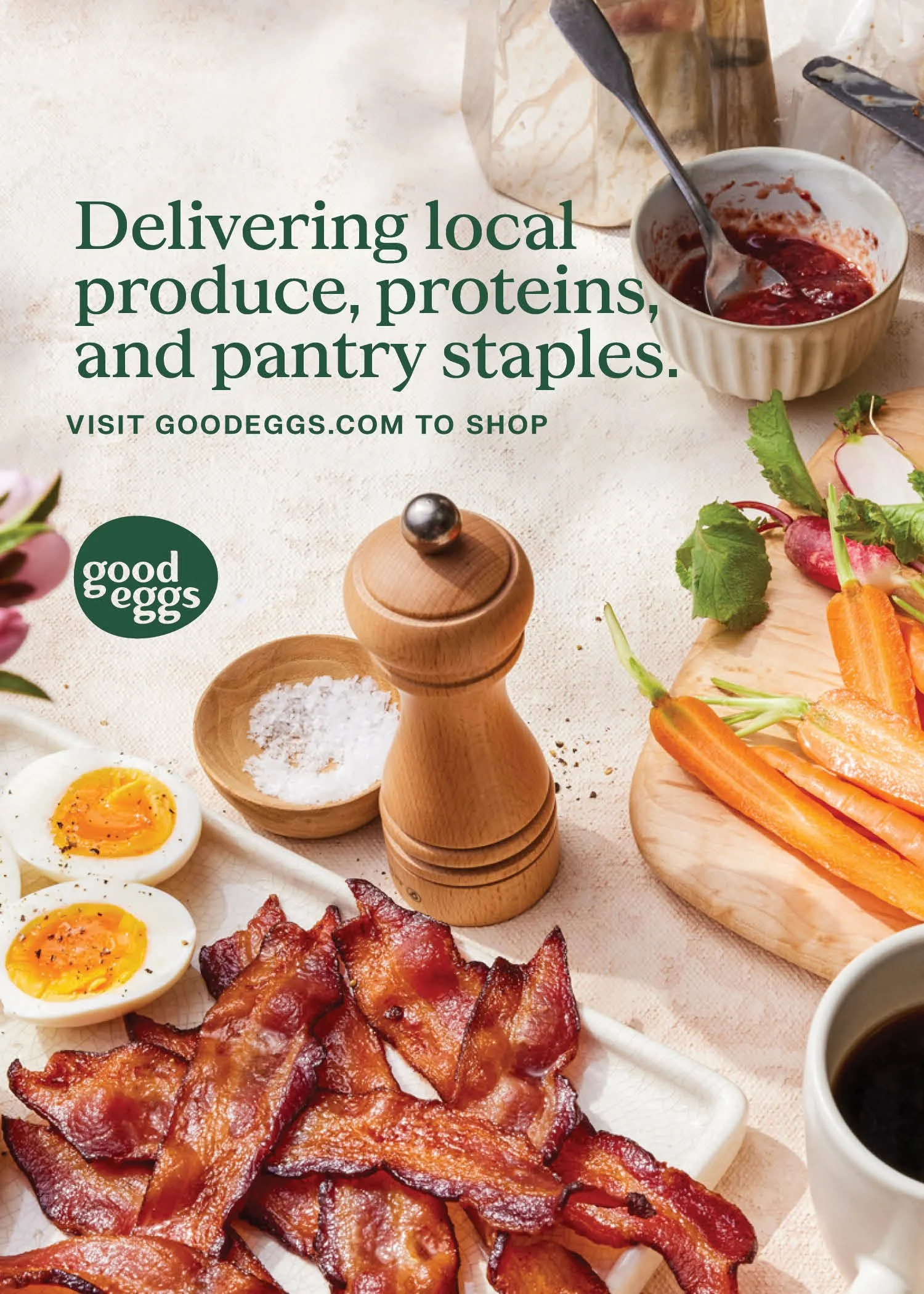
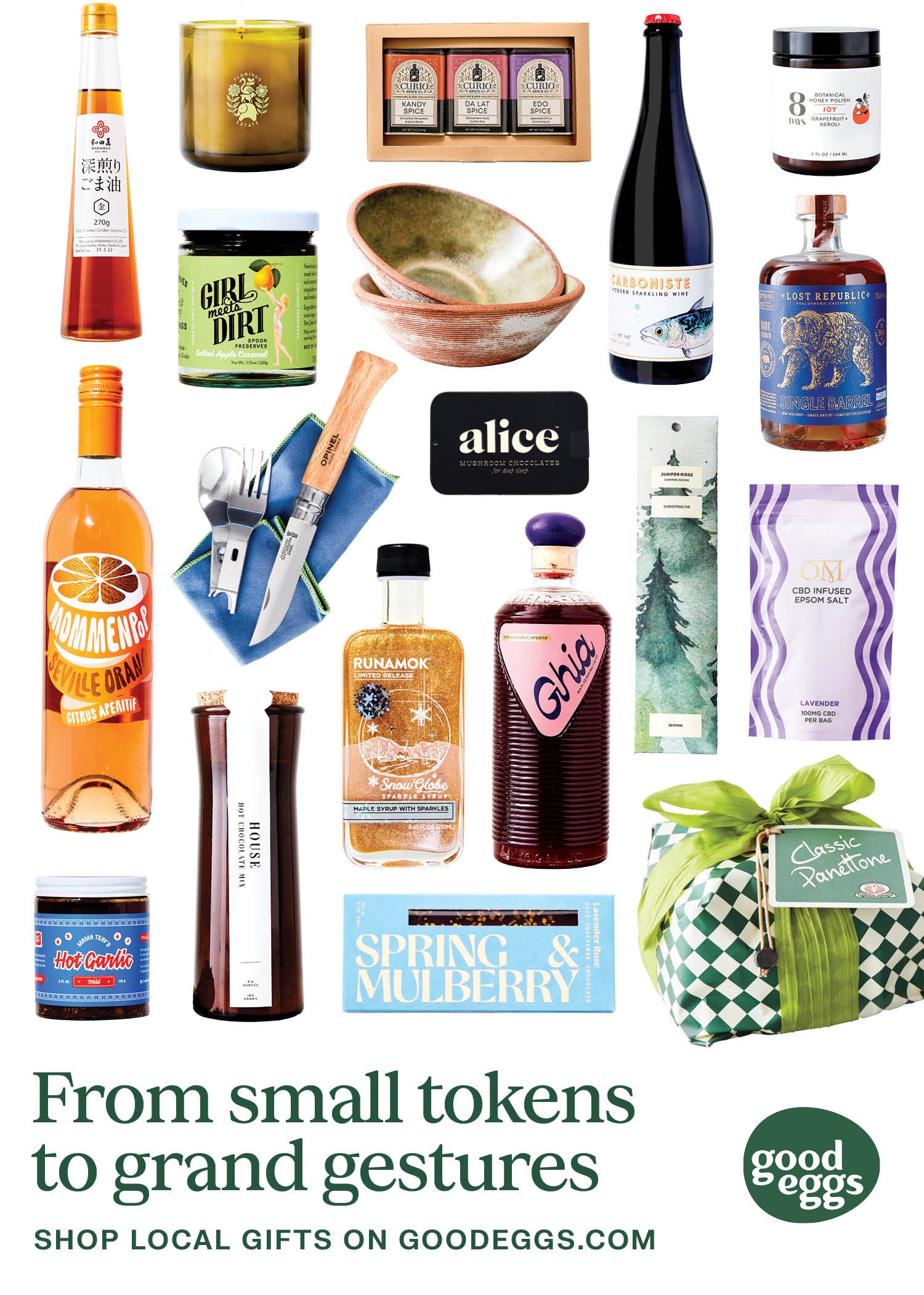
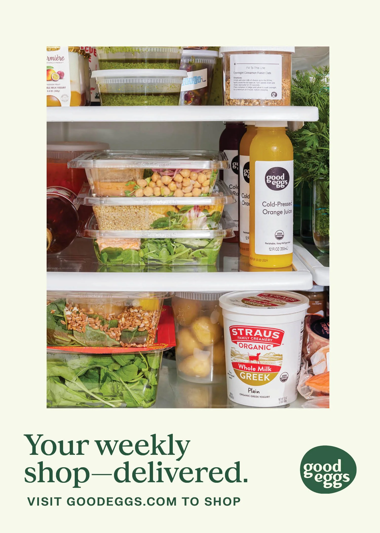
Our brand refresh took Good Eggs from a primarily black and white world to a more colorful, lifelike one. We developed an updated design language that paired a friendly and sophisticated set of typefaces with colorful photography and modular design sensibility.
We designed a suite of templates centered around highlighting the incredible items Good Eggs offers. These modular templates bring a sense intentional simplicity to the brand’s design languate, allowing the food and messaging to shine.
Typography
Concrette M by Displaay Type Foundry
FK Grotesk by Florian Karsten Typefaces




Art Direction
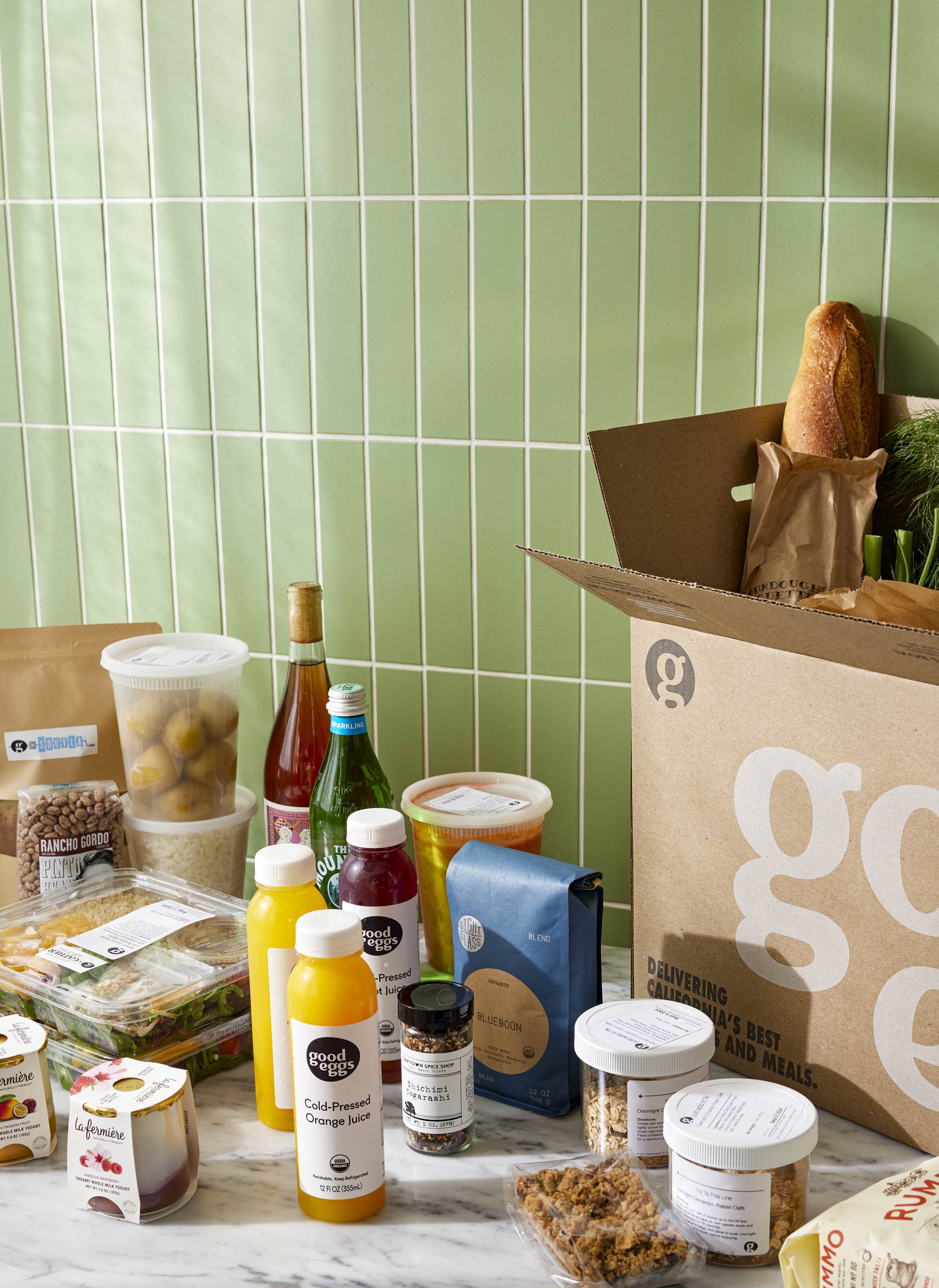
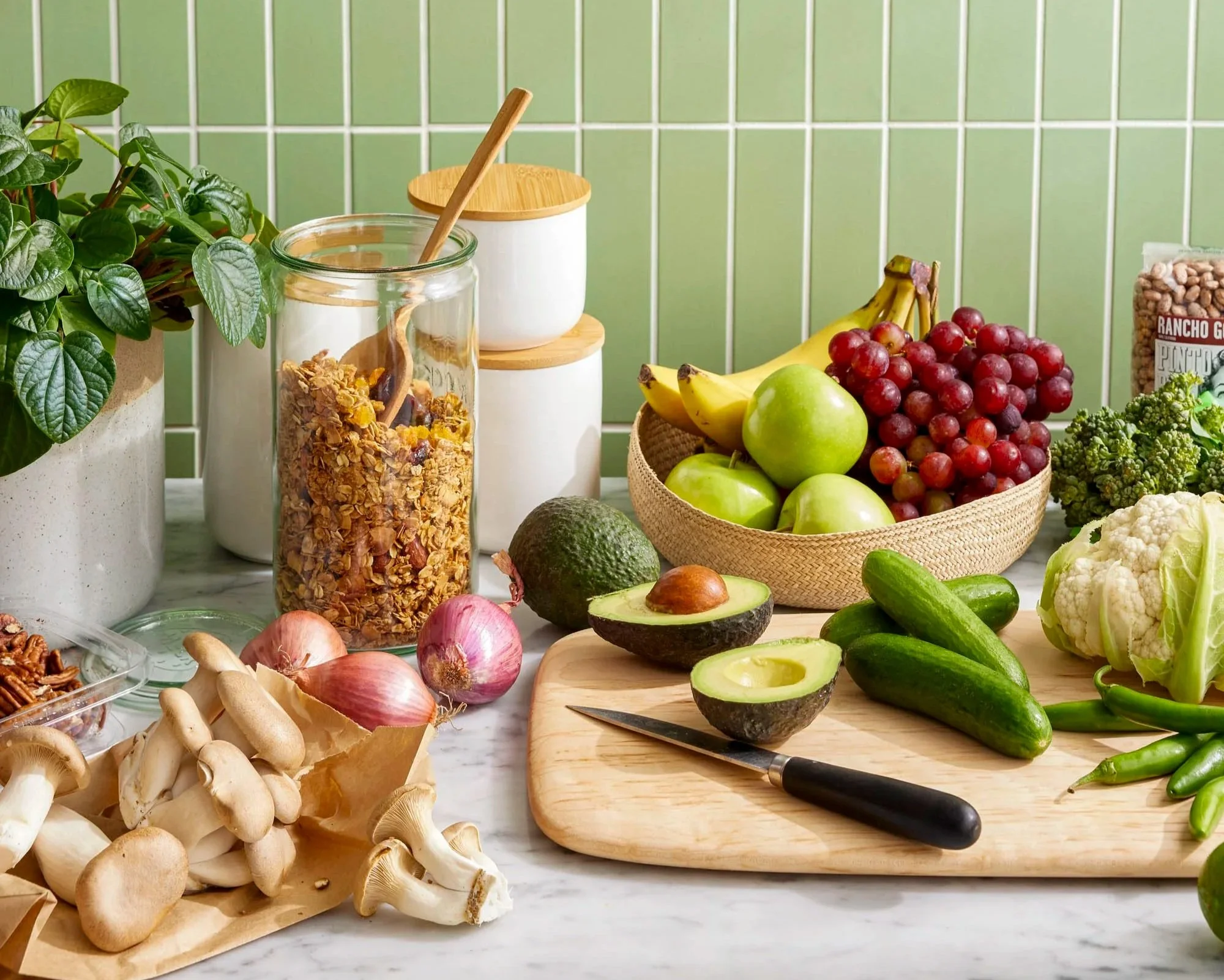
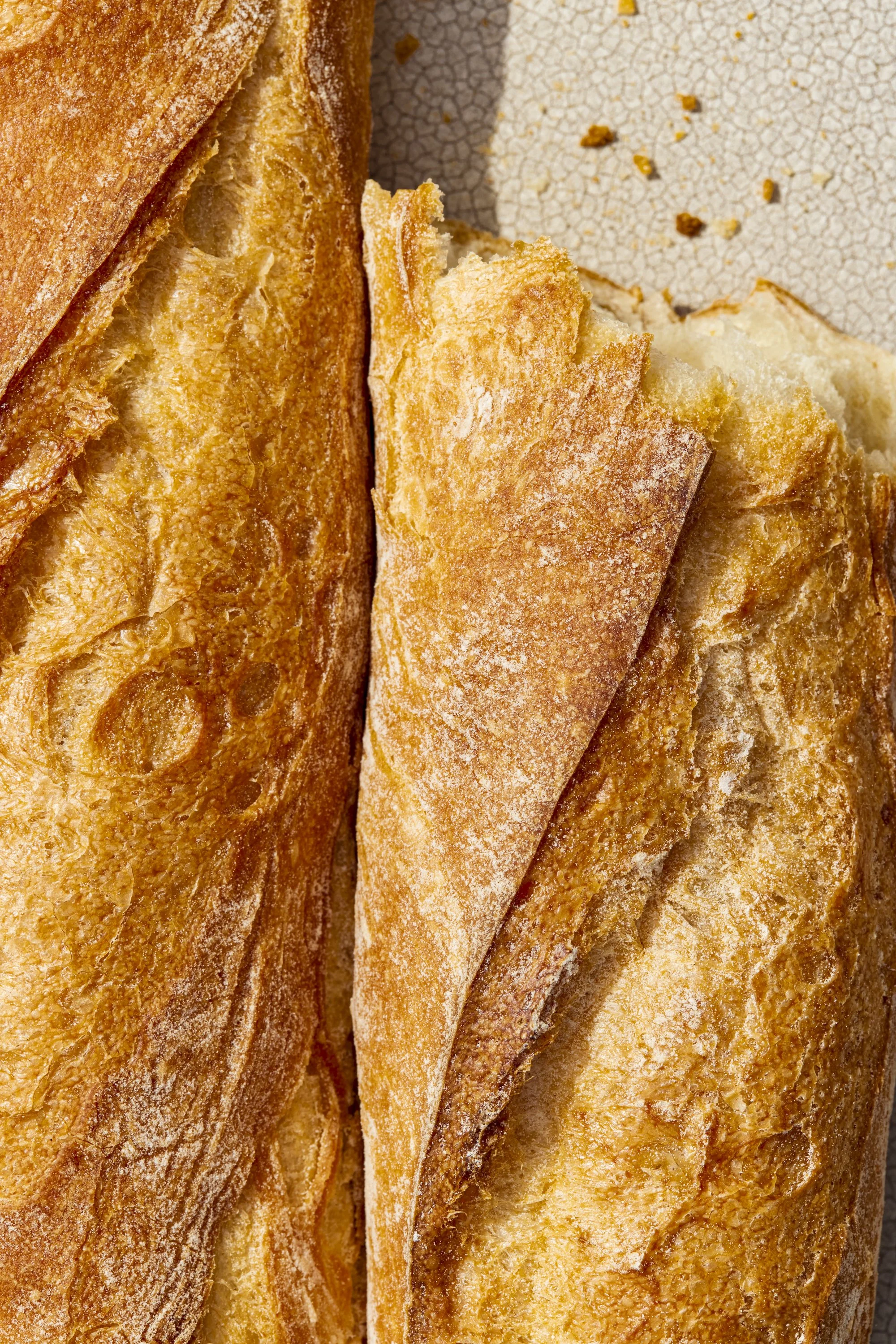
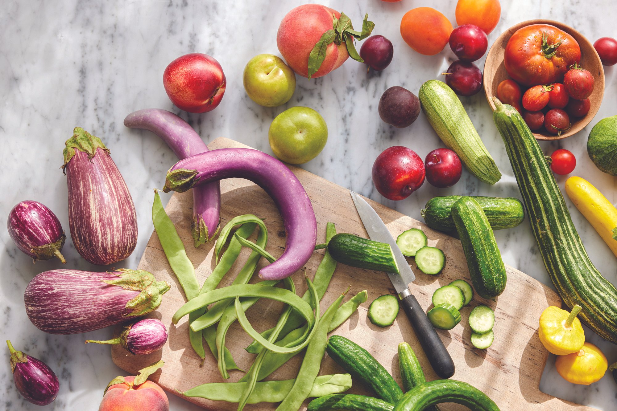
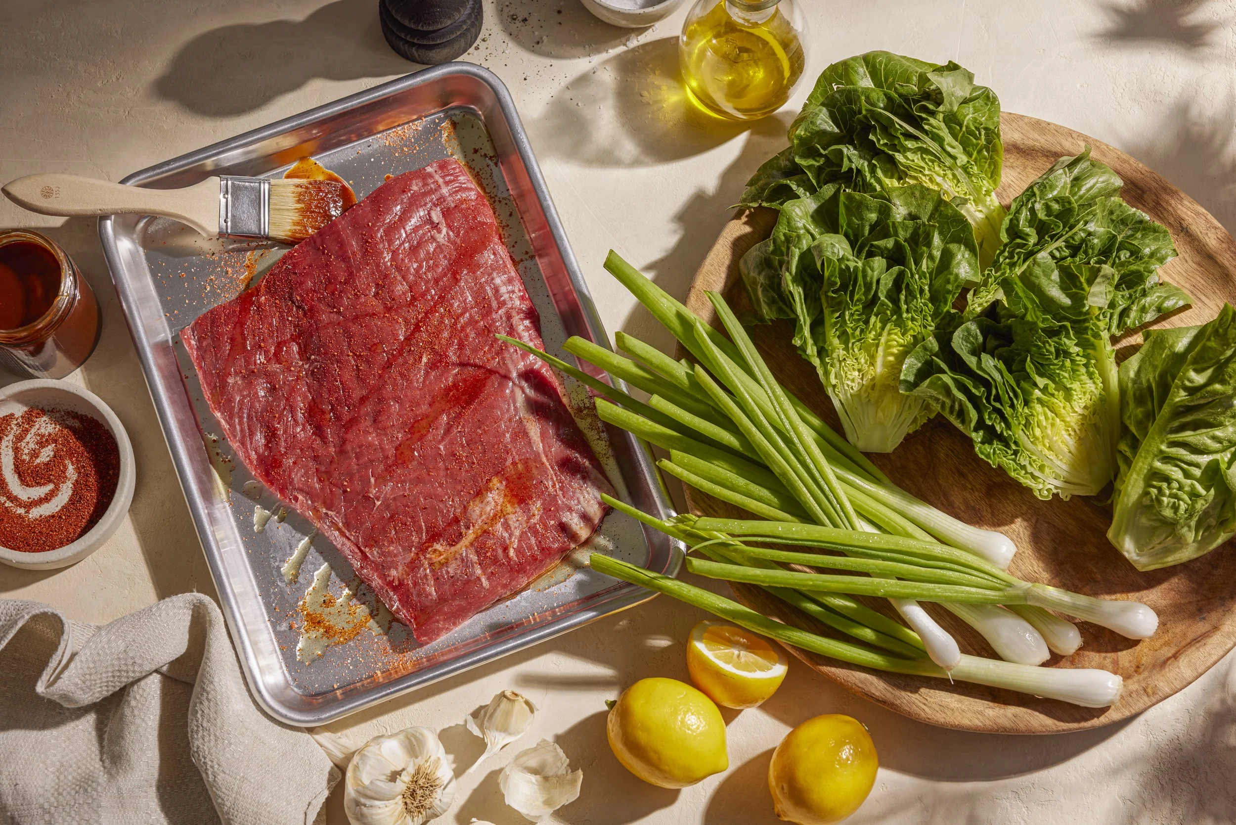
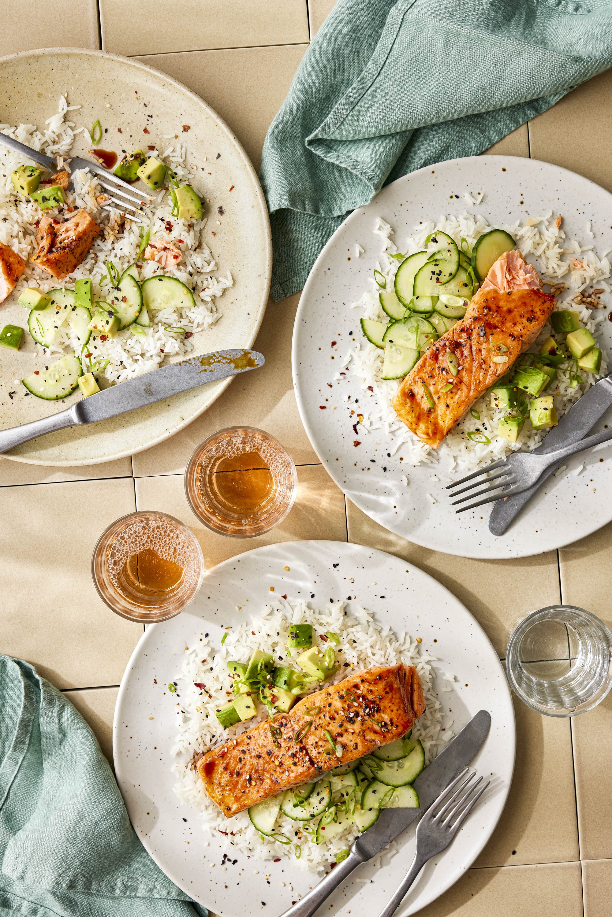
A key focus of our art direction strategy was to capture the vibrance of the items offered at Good Eggs. This resulted in imagery that featured more saturated colors, warmer tones, and natural-feeling light. We wanted the imagery to feel lived-in and welcoming—drawing in true food lovers.
Credits
VP of Marketing, Good Eggs: Christine Hendrickson
Photography: Erin Scott Studio
Photo Assist: Mark Davis and Andy Omvik
Food Styling: Lillian Kang
Styling Assist: Paige Arnett and Allison Fellion